

In Defence of North Facing Rooms
If you’ve ever read any advice on choosing paint colours, no doubt you’ve come across the idea of warm colours and cool colours, as well as warm or cool light.
As a rule of thumb in the northern hemisphere, rooms with south-facing windows receive a warm (yellowy) light which shifts as the sun moves across the sky, creating strong contrast between sunny and shadowed parts of the room.
Rooms with north-facing windows have a consistent cool (blue) light throughout the day. Rooms with east-facing windows receive warm light in the morning and cool light the rest of the day, whilst west-facing rooms do the opposite with cool light most of the day and warm light in the evenings.
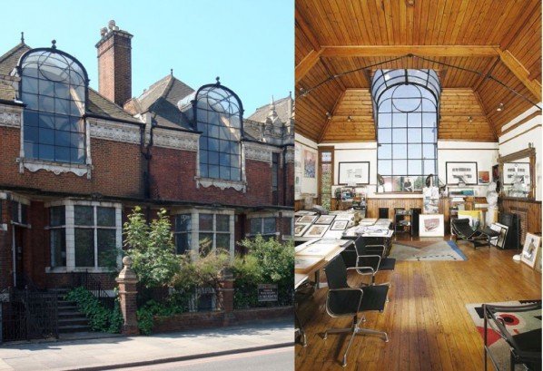
Rooms with a northern aspect are usually viewed as undesirable (I guess because it’s not as sunny) and something which needs to be counteracted with your paint colour. Actually, artists historically seek out studios with large north-facing windows for the consistency of light, such as the famous St Paul’s Studios on Talgarth Road in Highgate, London.
So it got me thinking, is this one of those preconceived ideas which we are told about and never question? It’s time to judge with your own eyes! Through my eyes, I feel that whether a room is dull or not is actually down to the size of the windows comparative to the size of the room. I find north-facing rooms with big windows provide a bright and fresh light which is really quite beautiful, and in terms of paint colour I would prefer to enhance this rather than try to counteract it.
I’ve got a dual aspect room with a small north-west facing window and an even smaller south-west facing window. It’s currently painted in Farrow & Ball’s Setting Plaster, which is often recommend for west-facing rooms, presumably in an attempt to warm it up. I can tell you now that it’s not working! This is one of my favourite paint colours but it looks rubbish in my room. The colour doesn’t look at its best, it looks like a dull peach, and it’s doing nothing to enhance the room either.
This room will never feel light and airy because there simply isn’t the natural light needed, so I’m going to embrace what I have got and enhance it instead. I’m aiming for a jewel box atmosphere with sumptuous, tactile materials and layered lighting. Given that the windows in this room are small and not letting enough light in, I’m going to counterbalance the darkness by adding pattern as this is the best way to make a north-facing room with small windows feel special. If you want a ready-made scheme that does exactly this, read this blog from 2023.

You may be familiar with the idea of ‘clean’ and ‘muddy’ colours, which is about how pure a colour is. Clean colours are primary and secondary colours, the version of red or blue or purple you often find in a kids paintbox. Muddy colours are those such as earth tones, they’re more natural and in terms of paint they are usually made of a more complex recipe of pigments. Our muted mauve is definitely a muddy colour, and the related saturated red is also not a totally clean red.
The images below show Setting Plaster in different lights. Whilst the conventional advice is to use a warm paint colour like this in a room with cool northern light to make the room feel warmer, you can see that the paint colour itself looks much better in warm southern light.


Below shows a blue such as Azurite by Edward Bulmer, which conventional advice tells us to use only in south facing rooms with warm light. However, the paint colour really sings when not fighting the light - it looks best in the cool northern room.


By constantly trying to counteract the conditions we already have in a room, we are always compromising. That doesn’t make for a wonderful interior in my book. I think the trick is to choose fundamentally cool colours with a warm undertone, to strike the balance between the colour looking its best without making the room feel cold. So if you have a north-facing room with big windows, consider how you can make the most of that beautiful consistent light instead of fighting it.
To enhance north-facing light, lean into a soft and serene vibe for the room.
Choose colours which look their best in cool light – muted and deep blues with warm undertones such as Azurite by Edward Bulmer, greyish greens such as Salix by Little Greene, or rich reds with blue undertones such as Geisha by Paint & Paper Library. To stop it feeling cold, avoid cool colours with an icy tinge such as Borrowed Light by Farrow & Ball or Delicate Blue by Little Greene, as well as pure black and pure white. If you need off-whites to complement your bolder colours, choose ones which are heavily muted (muddy) with neutral undertones such as Shaded White by Farrow & Ball.
For a really calming interior, use tonal colours for accents throughout the room. For example your curtains could be a shade lighter than your walls, your painted woodwork could be a shade darker, and your sofa could be a richer version of your core colour.
Alternatively for a cosier interior, use natural tones for accents such as cream, oatmeal and terracotta, as well as including natural materials such as wood, sisal or marble. With stone and silvery metals, choose brushed or honed finishes which look softer than polished finishes.
Layer up your lighting with multiple lamps at different heights, accent lighting such as picture lights, and diffused lighting such concealed LED strips for shelving. You can balance the cool daylight with 2700-3000k warm white bulbs, but be mindful of what lampshades you use as this affects the colour of light you get overall.
North-facing rooms have long been underestimated, often labelled as difficult to decorate, but if we learnt to embrace their natural qualities rather than fight them, we can create spaces that feel harmonious and inviting. So, instead of lamenting a north-facing room, see it as a blank canvas for a serene, sophisticated retreat within your home. And if you’d like more support to make the most of your four walls, get in touch, I’d love help help!